
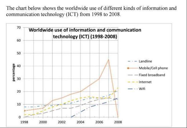
The line graph compares the usage of five different ways of information and communical technology around the world during 1998 to 2008 in percentum form.
The line graph compares the usage of five different ways of information and communical technology around the world during 1998 to 2008 in percentum form.