Tag Archives: ielts task 1 bar graph

How to describe a bar CHART

How to describe a bar CHART

How to describe a Bar chart

In this lesson, we’re going to learn how to tackle bar charts in IELTS Writing task 1 questions to get the highest score. To get a band 9 in IELTS Writing task 1, you should follow this answer structure:

  1. Introduction
  2. General overview
  3. Specific features

IELTS Bar chart answering strategy:

1. Introduction

You should start your answer by writing an introduction. The introduction is 1 or 2 sentences, where you paraphrase the information from your question. You should mention two things in your introduction:

  • what your graph shows
  • for what period of time

2. General Overview

The second paragraph of your answer is a general overview, where you briefly describe major trends on your graph. Ideally, you should describe 2-4 key features.

3. Specific details

After we’ve written the introduction and general overview, it’s time to give the specific details. You should describe the specific features in 2 or 3 (sometimes more) paragraphs.

When you have two countries (or two cities or any other two things depicted on the graph). The simplest way of grouping data is to describe each country’s trend in a separate paragraph.

When giving specific features, you have to write exact numbers/percentages and include as much details as you can.

How to choose information from the Bar chart?

Assuming one sentence contains around 10 to 15 words. We can estimate that your description of the Bar Chart will be made out of 10 to 12 sentences, we can now assign each sentence for a specific task:

  • One sentence for the introduction.
  • Two sentences with the superlative(usually marked by the suffix -est).
  • A sentence with a comparison. Make comparisons where relevant.
  • A sentence grouping two data points because they are similar.. ­
  • A sentence noting an exception. ­
  • A sentence describing some data in an advanced manner.
  • A sentence describing the data in a normal fashion.
  • Two sentences for the summary.

Note that these sentences don’t necessarily need to go in this particular order. You must write them in a way that makes your Bar Chart description flow naturally. You may also have to repeat a few sentences with different data if you find your graphic contains more information.
The structure above is a rough guide to get you started, once you are comfortable with it you can start experimenting. Just remember to get feedback while you are testing your ideas, otherwise, it’s quite difficult to improve.

Final tips on describing a Bar chart

  • Avoid listing every single data point by grouping the data together.
  • Avoid mixing formats, for example, don’t mix decimals with estimations in the same sentence.
  • After you have successfully written out your description with all of the information you wanted to include, go over it and replace some simpler words with more academic ones – this will get you more marks. For example, change “big” to “most significant”.
  • Check that the whole text is free of errors and mistakes.
  • Practice with different Bar Charts to improve.
  • Review the superlatives -these are essential if you want to effectively describe the chart.
  • The fastest way to improve is to get feedback on your work.
  • When analyzing a bar-chart, we cannot always give exact details (due to inaccuracies of the chart), so use words aroundabout, and approximately when giving inexact data.
  • Give data for each year shown on the chart
  • Look for the key data and make sure that you are comparing and contrasting the data, NOT just listing the data from one section to the next. If you just write about what happened to X, what happened to Y, and what happened to Z, without showing any relationship between them, you will not get a high score.
  •  You will need to look for similarities and differences when you first analyze the chart and you will need to decide what can logically be put together or not. This means that you don’t have to describe everything that you see in the bar chart, just the key points!
  • Group the data together so that you have a well-organized and coherent answer. It is a good idea to divide your answer into two or three paragraphs so it is well organized. To do this, you should group similar ideas together into paragraphs or sections.
  • Use a wide variety of sentence structures. Include complex sentences and simple sentences.

Bonus tip: Try copying out sample bar charts with pen and paper. You will start to understand what information to select. Also, your confidence will improve when it comes to writing your next essay.

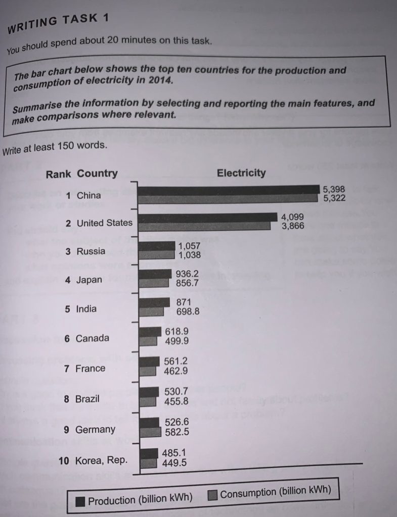
IELTS bar chart Question:

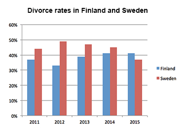
The bar chart shows the divorce rates in two European countries from 2011 to 2015.

Summarise the information by selecting and reporting the main features, and make comparisons where relevant.

Sample Answer

The bar graph provides information about the percentages of divorces in Finland and Sweden between 2011 and 2015.

Overall, Sweden experienced a downward trend, while Finland showed an upward trend throughout the period. Both countries’ divorce rates had some fluctuations. Although Finland initially had a lower rate, it outraced Sweden at the end of the period.

Sweden’s divorce rate was about 45% in 2011, being higher than Finland’s rate by approximately 8%. Then, it rose to almost fifty percent in 2012. However, the figure showed a gradual decrease to about 47% in 2013 and continued to decline steadily to the end of the period, reaching around 45% in 2014 and hitting a low point of about 37% in 2015.

The percentage of divorces in Finland was less than 40% in 2011, and it decreased in 2012, when about one third of marriages in Finland ended with a divorce (as opposed to almost a half in Sweden). However, the figure experienced a steady growth during the next two years. It rose to approximately 39% in 2013, then increased by around 3% in 2014, and remained steady for the next year, outracing the rate of Sweden.

(190 words)

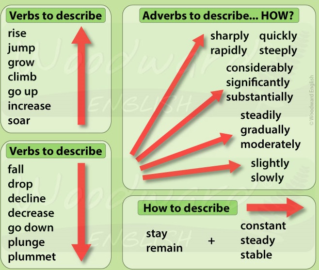
Vocabulary to describe the changes in Bar chart

Subscribe our Youtube Channel for more IELTS audio visual lessons.

Writing Task 1 – Bar Graph

Writing Task 1

You should spend about 20 minutes on this task.


The bar chart below shows the top ten countries for the production and consumption of electricity in 2014.

Summarise the information by selecting and reporting the main features, and make comparisons where relevant.


Write at least 150 words.

SAMPLE ANSWER 1

WRITING TASK 1 – BAR GRAPH

From the given bar chart that depicts the top ten countries for the production and consumption of electricity in 2014. For the production of electricity, the 1st rank is China that have 5,318 billion kwh, the 2nd rank is United States that have 4,049 billion kwh, the 3rd rank is Russia that have 1057 billion kwh, the 4th rank is Japan that have 9302 billion kwh, the 5th rank is India that have 841 billion kwh, the 6th rank that is Canada generate 618.9 billion kwh, 7th rank that is France have 561.2 billion kwh, 8th rank that is Brazil produce 590.4 bilion kwh, 9th rank that is Germany have 526.6 billion kwh and 10th rank that is Republic of Korea produce 485.1 billion kwh. For the consumption of electricity, 1st rank that is China acquire 5,322 billion kwh, 2nd rank that is United States have 3,866 billion kwh, 3rd is Russia that have 1,078 billion kwh, 4th rank that is Japan have 856.9 billion kwh, 5th rank that is India have 698.8 billion kwh, 6th rank that is Germany have 582.5 billion kwh, 7th rank that is Canada have 499.9 kwh, 8th rank that is France have 462.9 billion kwh, 9th rank that is Brazil have 455.8 kwh and 10th is Republic of Korea that have a total of 449.5 billion kwh.

From the information, the nation that have the most in production and consumption is China. The country that have the least in production and use is Republic of Korea.

Almost all the country have production more than consumption of electricity, except Germany that have use more than production.

(238 words)

This is an answer which achieved a Band 6.0 score. Here is the examiner’s comment:

This response is rather mechanical as it lists the countries in order of production and consumption of electricity, identifies the countries that produce and consume most and least and notes the fact that all the countries except Germany produce more than they consume. However, the writing is supported by data, although there are some errors in the figures. Organisation is limited and there are few examples of cohesive devices; similarly the range of vocabulary is limited although just adequate for the task. There is a mix of simple and complex sentence structures, but complex forms are mainly inaccurate.


SAMPLE ANSWER 2

WRITING TASK 1 – BAR GRAPH

The bar graph that show the best ten nations for the creation and utilization of power in 2014. For the creation of power, the 1 position is China that have 5,318 billion kwh, the 2 position is United States that have 4,049 billion kwh, the 3 position is Russia that have 1057 billion kwh, the 4 position is Japan that have 9302 billion kwh, the 5 position is India that have 841 billion kwh, the rank that is Canada have 618.9 billion kwh, seventh position that is France have 561.2 billion kwh, eighth position that is Brazil have 590.4 bilion kwh, ninth position that is Germany have 526.6 billion kwh and tenth position that is Republic of Korea have 485.1 billion kwh. For the utilization of power, first position that is China have 5,322 billion kwh, second position that is United States have 3,866 billion kwh, third is Russia that have 1,078 billion kwh, fourth position that is Japan have 856.9 billion kwh, fifth position that is India have 698.8 billion kwh, sixth position that is Germany have 582.5 billion kwh, seventh position that is Canada have 499.9 kwh, eighth position that is France have 462.9 billion kwh, ninth position that is Brazil have 455.8 kwh and tenth is Republic of korea that have 449.5 billion kwh.

From the data, the nation that have the most underway and utilization is China. The nation that have the least underway and utilization is Republic of Korea.

Practically all the nation have creation more than utilization, aside from Germany that have utilization more than creation.

(230 words)

This is an answer which achieved a Band 6.5 score. Here is the examiner’s comment:

This answer is somewhat mechanical as it records the nations arranged by creation and utilization of power, distinguishes the nations that deliver and expend most and least and notes the way that all the nations with the exception of Germany produce more than they devour. Be that as it may, the composing is upheld by information, in spite of the fact that there are a few blunders in the figures. Association is constrained and there are not many instances of firm gadgets; comparatively the scope of jargon is restricted albeit only sufficient for the assignment. There is a blend of straightforward and complex sentence structures, however complex structures are for the most part incorrect.


SAMPLE ANSWER 3

The reference chart that show the best ten countries for the creation and use of intensity in 2014. For the making of intensity, the 1 position is China that have 5,318 billion kwh, the 2 position is United States that have 4,049 billion kwh, the 3 position is Russia that have 1057 billion kwh, the 4 position is Japan that have 9302 billion kwh, the 5 position is India that have 841 billion kwh, the rank that is Canada have 618.9 billion kwh, seventh position that is France have 561.2 billion kwh, eighth position that is Brazil have 590.4 bilion kwh, ninth position that is Germany have 526.6 billion kwh and tenth position that is Republic of Korea have 485.1 billion kwh. For the usage of intensity, first position that is China have 5,322 billion kwh, second position that is United States have 3,866 billion kwh, third is Russia that have 1,078 billion kwh, fourth position that is Japan have 856.9 billion kwh, fifth position that is India have 698.8 billion kwh, 6th position that is Germany have 582.5 billion kwh, seventh position that is Canada have 499.9 kwh, eighth position that is France have 462.9 billion kwh, ninth position that is Brazil have 455.8 kwh and tenth is Republic of korea that have 449.5 billion kwh.

For all intents and purposes all the country have creation more than use, beside Germany that have usage more than creation.

From the information, the country that have the most in progress and usage is China. The country that have the least in progress and use is Republic of Korea.

(195 words)

This is an answer which achieved a Band 6.0 score. Here is the examiner’s comment:

This answer is to some degree mechanical as it records the countries organized by creation and usage of intensity, recognizes the countries that convey and exhaust most and least and notes the way that all the countries except for Germany produce more than they eat up. In any case, the forming is maintained by data, despite the way that there are a couple of goofs in the figures. Affiliation is compelled and there are very few occasions of firm devices; similarly the extent of language is confined but just adequate for the task. There is a mix of direct and complex sentence structures, anyway complex structures are generally wrong.


Like and Subscribe our Youtube Channel Way To Crack IELTS