Writing Task 1
You should spend about 20 minutes on this task.
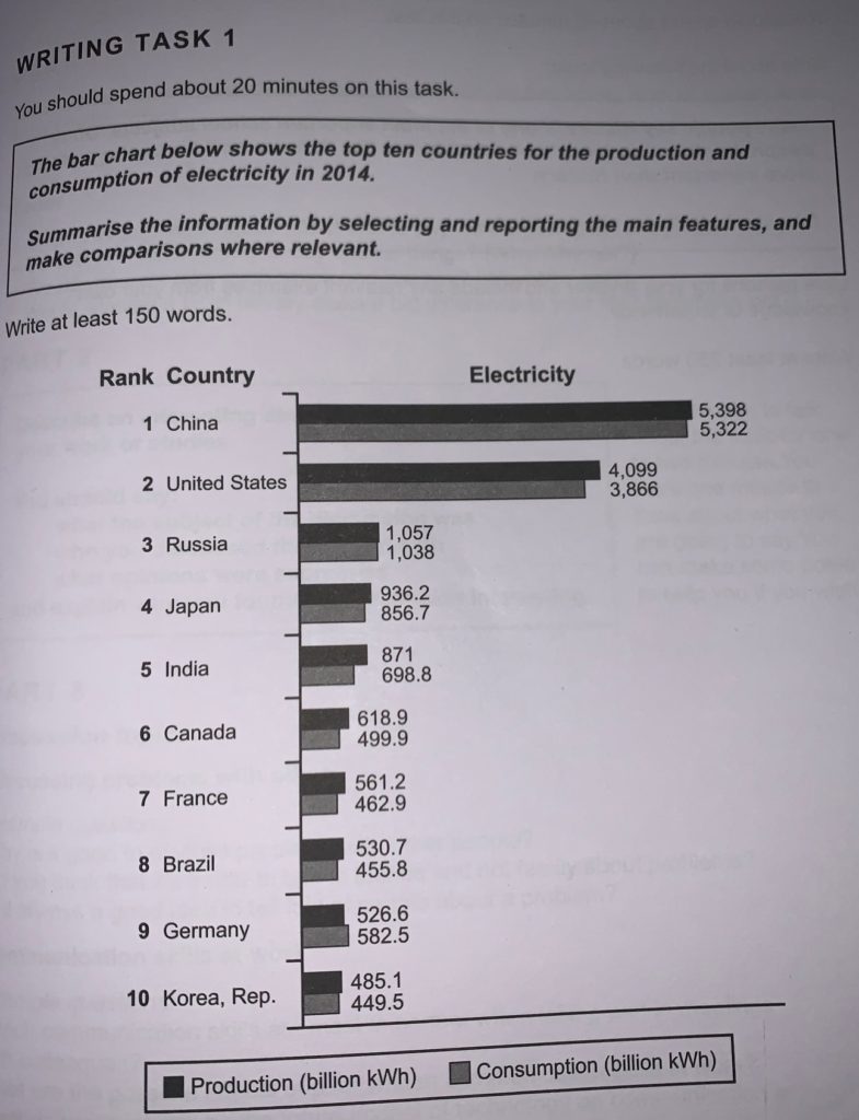
The bar chart below shows the top ten countries for the production and consumption of electricity in 2014.
Summarise the information by selecting and reporting the main features, and make comparisons where relevant.
Write at least 150 words.

SAMPLE ANSWER 1
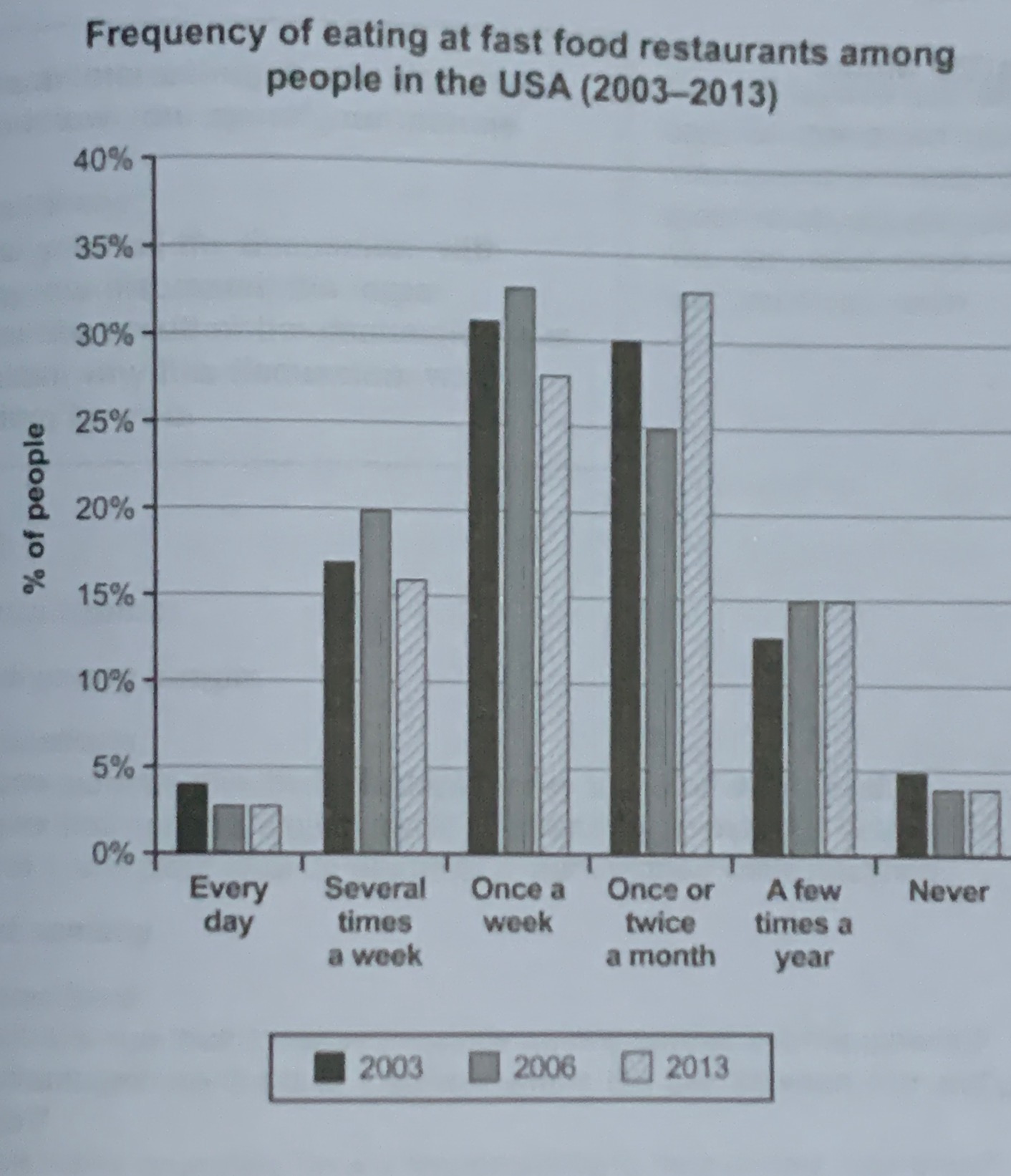
From the given bar chart that depicts the top ten countries for the production and consumption of electricity in 2014. For the production of electricity, the 1st rank is China that have 5,318 billion kwh, the 2nd rank is United States that have 4,049 billion kwh, the 3rd rank is Russia that have 1057 billion kwh, the 4th rank is Japan that have 9302 billion kwh, the 5th rank is India that have 841 billion kwh, the 6th rank that is Canada generate 618.9 billion kwh, 7th rank that is France have 561.2 billion kwh, 8th rank that is Brazil produce 590.4 bilion kwh, 9th rank that is Germany have 526.6 billion kwh and 10th rank that is Republic of Korea produce 485.1 billion kwh. For the consumption of electricity, 1st rank that is China acquire 5,322 billion kwh, 2nd rank that is United States have 3,866 billion kwh, 3rd is Russia that have 1,078 billion kwh, 4th rank that is Japan have 856.9 billion kwh, 5th rank that is India have 698.8 billion kwh, 6th rank that is Germany have 582.5 billion kwh, 7th rank that is Canada have 499.9 kwh, 8th rank that is France have 462.9 billion kwh, 9th rank that is Brazil have 455.8 kwh and 10th is Republic of Korea that have a total of 449.5 billion kwh.
From the information, the nation that have the most in production and consumption is China. The country that have the least in production and use is Republic of Korea.
Almost all the country have production more than consumption of electricity, except Germany that have use more than production.
(238 words)
This is an answer which achieved a Band 6.0 score. Here is the examiner’s comment:
This response is rather mechanical as it lists the countries in order of production and consumption of electricity, identifies the countries that produce and consume most and least and notes the fact that all the countries except Germany produce more than they consume. However, the writing is supported by data, although there are some errors in the figures. Organisation is limited and there are few examples of cohesive devices; similarly the range of vocabulary is limited although just adequate for the task. There is a mix of simple and complex sentence structures, but complex forms are mainly inaccurate.
SAMPLE ANSWER 2
WRITING TASK 1 – BAR GRAPH
The bar graph that show the best ten nations for the creation and utilization of power in 2014. For the creation of power, the 1 position is China that have 5,318 billion kwh, the 2 position is United States that have 4,049 billion kwh, the 3 position is Russia that have 1057 billion kwh, the 4 position is Japan that have 9302 billion kwh, the 5 position is India that have 841 billion kwh, the rank that is Canada have 618.9 billion kwh, seventh position that is France have 561.2 billion kwh, eighth position that is Brazil have 590.4 bilion kwh, ninth position that is Germany have 526.6 billion kwh and tenth position that is Republic of Korea have 485.1 billion kwh. For the utilization of power, first position that is China have 5,322 billion kwh, second position that is United States have 3,866 billion kwh, third is Russia that have 1,078 billion kwh, fourth position that is Japan have 856.9 billion kwh, fifth position that is India have 698.8 billion kwh, sixth position that is Germany have 582.5 billion kwh, seventh position that is Canada have 499.9 kwh, eighth position that is France have 462.9 billion kwh, ninth position that is Brazil have 455.8 kwh and tenth is Republic of korea that have 449.5 billion kwh.
From the data, the nation that have the most underway and utilization is China. The nation that have the least underway and utilization is Republic of Korea.
Practically all the nation have creation more than utilization, aside from Germany that have utilization more than creation.
(230 words)
This is an answer which achieved a Band 6.5 score. Here is the examiner’s comment:
This answer is somewhat mechanical as it records the nations arranged by creation and utilization of power, distinguishes the nations that deliver and expend most and least and notes the way that all the nations with the exception of Germany produce more than they devour. Be that as it may, the composing is upheld by information, in spite of the fact that there are a few blunders in the figures. Association is constrained and there are not many instances of firm gadgets; comparatively the scope of jargon is restricted albeit only sufficient for the assignment. There is a blend of straightforward and complex sentence structures, however complex structures are for the most part incorrect.
SAMPLE ANSWER 3
The reference chart that show the best ten countries for the creation and use of intensity in 2014. For the making of intensity, the 1 position is China that have 5,318 billion kwh, the 2 position is United States that have 4,049 billion kwh, the 3 position is Russia that have 1057 billion kwh, the 4 position is Japan that have 9302 billion kwh, the 5 position is India that have 841 billion kwh, the rank that is Canada have 618.9 billion kwh, seventh position that is France have 561.2 billion kwh, eighth position that is Brazil have 590.4 bilion kwh, ninth position that is Germany have 526.6 billion kwh and tenth position that is Republic of Korea have 485.1 billion kwh. For the usage of intensity, first position that is China have 5,322 billion kwh, second position that is United States have 3,866 billion kwh, third is Russia that have 1,078 billion kwh, fourth position that is Japan have 856.9 billion kwh, fifth position that is India have 698.8 billion kwh, 6th position that is Germany have 582.5 billion kwh, seventh position that is Canada have 499.9 kwh, eighth position that is France have 462.9 billion kwh, ninth position that is Brazil have 455.8 kwh and tenth is Republic of korea that have 449.5 billion kwh.
For all intents and purposes all the country have creation more than use, beside Germany that have usage more than creation.
From the information, the country that have the most in progress and usage is China. The country that have the least in progress and use is Republic of Korea.
(195 words)
This is an answer which achieved a Band 6.0 score. Here is the examiner’s comment:
This answer is to some degree mechanical as it records the countries organized by creation and usage of intensity, recognizes the countries that convey and exhaust most and least and notes the way that all the countries except for Germany produce more than they eat up. In any case, the forming is maintained by data, despite the way that there are a couple of goofs in the figures. Affiliation is compelled and there are very few occasions of firm devices; similarly the extent of language is confined but just adequate for the task. There is a mix of direct and complex sentence structures, anyway complex structures are generally wrong.
Like and Subscribe our Youtube Channel Way To Crack IELTS